Project Case Study  ·  Applied Machine Learning

HeartBeacon

The most accurate model was the worst one to ship. On a target where 92% of patients are healthy, accuracy rewards a model for staying silent — so the selection metric had to change before the modelling did.

0
CDC Records
0
Class Imbalance
0
Recall Achieved
5 × 3
Sampling × Models

Domain  Healthcare Risk Analytics
Stack  Python · scikit-learn · Seaborn
Year  2024
01 — Market Context

The expensive part of heart disease
is finding it late.

Cardiovascular disease is the largest single cost centre in American healthcare and the leading cause of death. It is also, by the WHO’s assessment, largely preventable. The gap between those two facts is where a screening model earns its keep.

919,032
Americans died of cardiovascular disease in 2023 — one in every three deaths, one every 34 seconds.
$168B
Spent on heart disease health services and medication across 2021–2022 in the US alone.
0
Lab tests, scans or clinic visits this model requires. Every input is a survey answer.
The commercial unlock

That third number is the one that matters commercially. The WHO notes that “most cardiovascular diseases can be prevented by addressing behavioural and environmental risk factors” — tobacco, diet and obesity, physical inactivity, alcohol. Those are exactly the variables the CDC survey captures, and exactly what this model consumes.

So the model does not compete with an ECG or a lipid panel. It runs upstream of them, on data a health plan or employer already holds, at effectively zero marginal cost per person. That changes who can deploy it: not just hospitals, but payers, employer wellness programmes and public health agencies screening whole populations to decide who gets the expensive test.

The buyer is whoever carries the downstream cost. A model that cheaply ranks a million people by risk is worth something to an insurer or an employer precisely because the follow-up it triggers is expensive and the event it prevents is far more expensive still.


02 — Situation

Screening is a volume problem
before it is a modelling problem.

Cardiovascular disease is largely preventable when caught early, but screening every adult in a population is not economically possible. The question is therefore not who has heart disease — it is who is worth a clinician's time.

The dataset is the CDC's annual health survey: 319,795 respondents across 18 variables, mixing behavioural, demographic and self-reported clinical signals — BMI, smoking and alcohol use, stroke history, days of poor physical and mental health, difficulty walking, age band, diabetes status, physical activity, general health rating and sleep duration.

That makes it a triage dataset rather than a diagnostic one. Nothing here is a blood panel or an ECG. The realistic goal is to narrow a population down to a group worth testing properly, which sets the bar for what a useful model looks like.


03 — Complication

The metric everyone reaches for
was actively misleading.

The target splits 10.68 to 1 — roughly 92% of respondents report no heart disease. That ratio has an uncomfortable consequence:

A model that predicts “no heart disease” for every single person scores about 91% accuracy on this data — while finding nobody at all. Any model reporting accuracy in the high eighties has to be checked against that floor before the number means anything.

So accuracy was ruled out as a selection metric at the start. The metric that actually matters for screening is recall on the positive class: of the people who do have heart disease, how many did we flag? A missed case walks out of the clinic undiagnosed. A false alarm costs one follow-up test. Those are not symmetric errors, and the metric should not pretend they are.

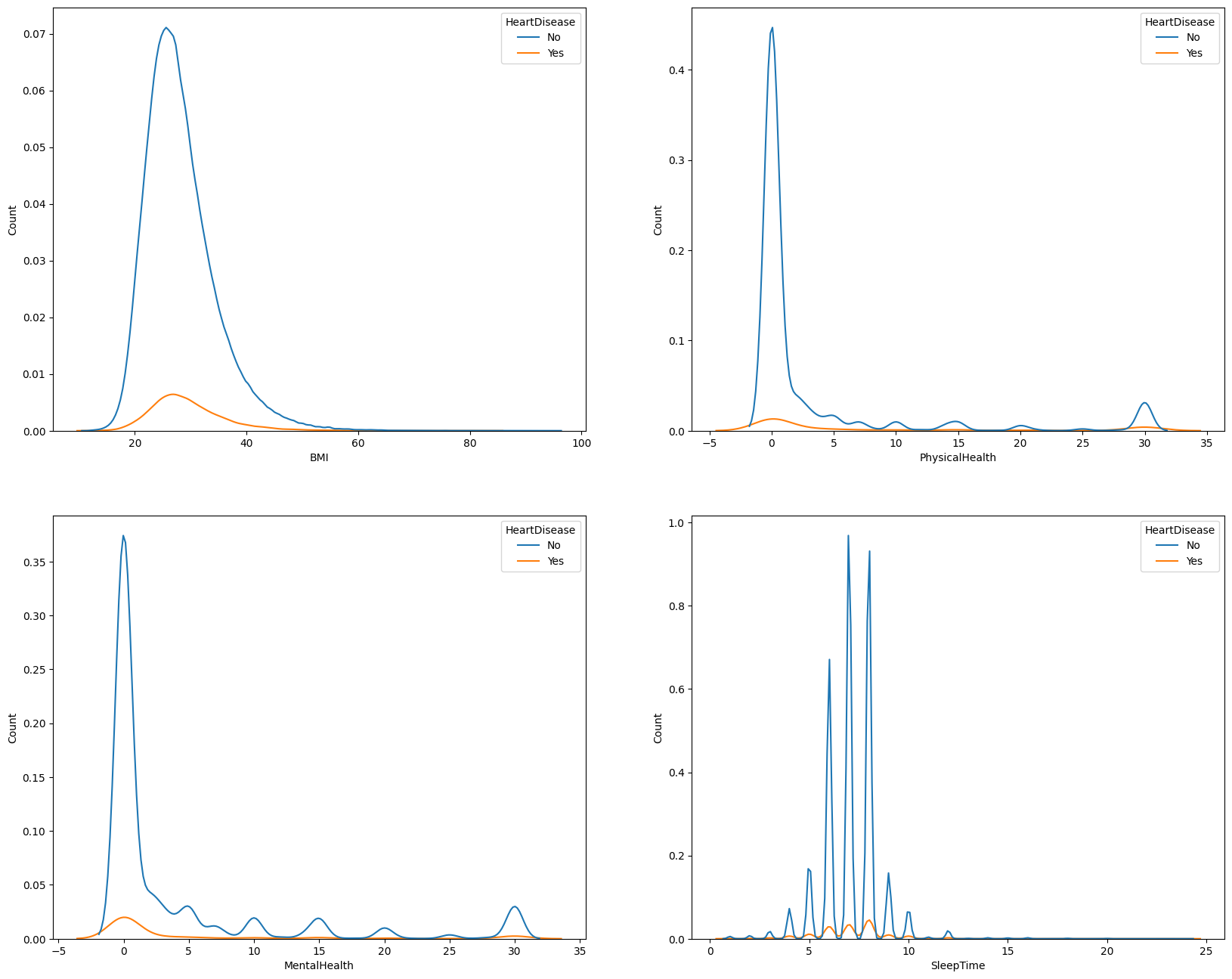
Kernel density plots of BMI, physical health, mental health and sleep time, split by heart disease status
The imbalance, visually. Across every continuous feature, the positive class (orange) is dwarfed by the negative class (blue). The distributions also overlap heavily — no single variable separates the classes cleanly, which rules out a simple threshold rule.

04 — Approach

Fix the data, then fix the balance,
then compare honestly.

The work split into three stages. Each one was constrained by the same principle: do not let a preprocessing choice quietly inflate the final numbers.

STAGE 01

Clean and condition

Duplicates removed, then outliers handled per-feature rather than with one blanket rule:

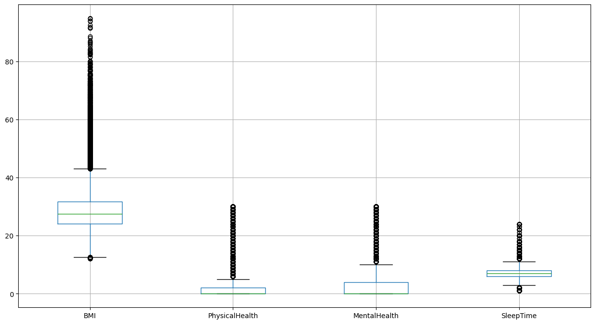
  • BMI — 2.95% beyond [12.60, 43.08], removed
  • Sleep time — 1.50% beyond [3.0, 11.0], removed
  • Physical health — 15.62% outliers, log-transformed
  • Mental health — 13.16% outliers, log-transformed
STAGE 02

Encode and scale

Label encoding across fourteen categorical variables, then standardisation of the continuous features so no single variable dominated on magnitude alone.

The two health-day variables were log-transformed rather than trimmed, because the heavy right tail is real signal — people genuinely do report thirty bad days — not measurement error.

STAGE 03

Rebalance five ways

Rather than defaulting to SMOTE, five strategies were evaluated against each other:

Random under-sampling Random over-sampling Tomek links SMOTE Near Miss
STAGE 04

Compare three model families

Logistic Regression, Decision Tree and Random Forest — deliberately spanning a linear baseline, a single interpretable tree and an ensemble, so the comparison would show whether added complexity was buying anything real.

Box plots showing outlier distribution across BMI, physical health, mental health and sleep time
Why outliers got per-feature treatment. BMI carries extreme high-side outliers that are implausible as measurements and were removed. Physical and mental health days cluster at zero with a long tail to thirty — that shape is the real distribution, so those were transformed instead.

05 — Results

Accuracy and recall pointed
at opposite models.

Random Forest won on accuracy by a wide margin and lost on the only metric that mattered. Plotted side by side, the trade-off is unambiguous:

Logistic RegressionRandom under-sampling
Accuracy
0.73
Recall
0.77
Decision TreeRandom over-sampling
Accuracy
0.73
Recall
0.70
Random ForestRandom over-sampling
Accuracy
0.89
Recall
0.20
Overall accuracy Recall, positive class
ModelSamplingAccuracyRecall (class 1)Precision (class 0)F1 (class 1)
Logistic RegressionRandom under-sampling0.73280.770.970.33
Decision TreeRandom over-sampling0.73300.700.960.31
Random ForestRandom over-sampling0.88740.200.93—

Random Forest caught one in five. It scored fifteen accuracy points above Logistic Regression while finding 20% of at-risk patients against 77%. On a screening problem that is not a close call — the ensemble was learning to agree with the majority class, which is exactly what the imbalance rewards.

Random under-sampling produced the strongest positive-class recall across model families, which is consistent with what it does: it removes the majority-class mass that was drowning the signal, at the cost of throwing away data. Here that trade was worth taking.

The honest caveat: F1 on the positive class sits at 0.33, which means precision is low — most flagged patients will not have heart disease. For a triage step that routes people to a cheap follow-up test, that is an acceptable cost. For anything that drives treatment, it is not. The model is fit for the first job and unfit for the second.


06 — The Decision

Choose the metric first,
and the model follows.

Logistic Regression with random under-sampling was selected — the lowest-accuracy model of the three, and the only one that did the job it was built for.

Choosing it also meant accepting a simpler model than the ensemble, which turned out to be an advantage rather than a concession. Logistic Regression exposes its coefficients, so a clinician can see which factors pushed a patient over the line. On a screening tool that someone has to trust and act on, an explainable model beats an opaque one with better paper metrics.

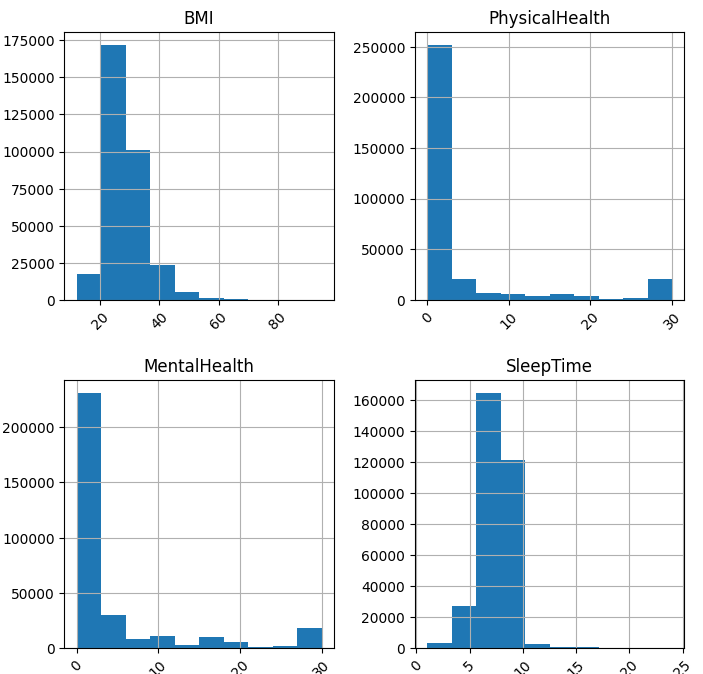
Histograms of BMI, physical health days, mental health days and sleep time across the full population
The underlying population. BMI is near-normal with a right skew; the health-day variables are zero-inflated with a spike at thirty; sleep time concentrates tightly between six and eight hours. These shapes drove both the transformation choices and the decision to standardise before modelling.

07 — Implementation Path

What it would take
to put this in front of patients.

A model that selects well in a notebook is perhaps a third of the way to something a health plan can actually run. The remaining work is mostly not modelling.

STEP 01

Calibrate before anyone acts on a score

A screening score that drives outreach has to mean something — if the system says 0.70, roughly 70% of those people should turn out positive. Boosted and resampled models rarely satisfy that out of the box. Platt scaling or isotonic regression against a held-out fold, validated with a reliability curve, comes before deployment, not after.

STEP 02

Set the threshold from cost, not convention

0.5 is a library default. The right cut-off comes from the ratio of what a false alarm costs — one follow-up test — to what a missed case costs. Because those differ by orders of magnitude here, the economically correct threshold sits well below 0.5, and it is a business input rather than a modelling one.

STEP 03

Monitor the population, not just the model

BRFSS is re-collected annually and the population it describes shifts. Smoking rates fall, obesity rates climb. Drift monitoring on input distributions and on the positive rate matters more here than model-level accuracy alerts, because the model will fail silently before it fails loudly.

STEP 04

Scope it explicitly as triage

This ranks people for follow-up. It does not diagnose, and at 0.33 F1 it must never be presented as though it does. Clinical governance, a documented intended-use statement and a human decision point between score and patient contact are prerequisites, not nice-to-haves.


08 — What I Learned

Where this falls short.

The model answers the question it was given. Several things would need to change before it could answer a harder one — and each of them taught me something I now reach for by default.

01

Report PR-AUC, not F1

On a heavily imbalanced target, precision–recall AUC describes the whole trade-off curve rather than one arbitrary threshold. F1 at 0.33 is a single point on that curve and undersells where the model is genuinely useful.

02

Validate externally

Every number here comes from one survey year of one country's population. Generalisability is asserted, not demonstrated. A second dataset from a different source is the only way to know whether this holds.

03

Tune, then re-compare

The models were compared at default hyperparameters. Random Forest in particular is likely to improve with class weighting and depth limits — the comparison is fair, but it is not the ceiling.

04

Engineer interaction features

The current features are treated independently, but cardiovascular risk compounds — age with diabetes with smoking is not the sum of its parts. Interaction terms are the obvious next lever.

The broader lesson transfers past this dataset: on any rare-event problem — fraud, churn, defects, disease — the default metric will quietly reward a model for predicting nothing happens. Establishing the majority-class baseline before reporting a single result is what separates a number from a finding.

Explore

More work.

Code on GitHub All projects Get in touch